How I brought clarity to Canada Post's error messages—and why "just fix the copy" wasn't enough
The challenge: A messy error messaging landscape
When Canada Post asked me to refine some error messages, I thought it'd be a quick fix. Some cleaner copy, a bit of clarity. Simple, right? But when I took a closer look, I saw the real problem.
- No consistency → One product apologized profusely, while another just said, "Oops."
- No structure → Some errors explained what went wrong. Others? Not so much.
- No shared guidance → Each team was writing their own version of "error messaging" without any alignment.
Sure, I could've just polished the wording. But without solving the root issue, the inconsistencies would just pile up again. That's when it was clear we needed a better system.
Building a case for clarity
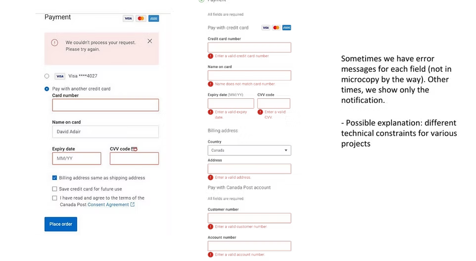
Since error messaging wasn't on anyone's radar, I pulled together a content audit to show exactly how the inconsistency was playing out. Screenshots, comparisons, and a few "What even is this?" moments made it clear.
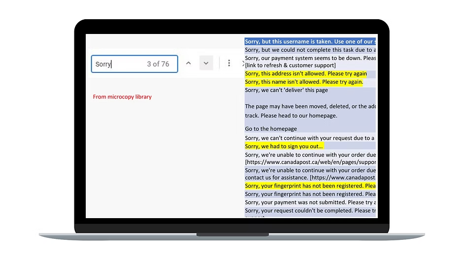
Next, I brought the challenge to the Content Operations team, a group of UX writers from across Canada Post, during our workshops. I facilitated the following discussions:
- What makes an error message helpful?
- Where do users get stuck?
- What's the tone when something goes wrong?
The solution: A framework that scales
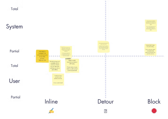
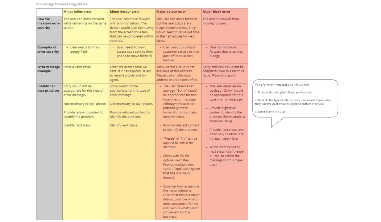
The workshop resulted in a framework with the following dimensions:
- Standardized categories → Every error now had a "why" and a "what's next."
- Tone and voice principles → Empathy when it's needed, clarity always.
- Message templates → Easy-to-follow patterns that ensured consistency across products.
No more second-guessing. No more "Is this how we do it?" Just clear, helpful messages from every team, for every user.
The impact: more clarity, fewer roadblocks
With the framework in place:
- UX writers had the confidence to create clear, actionable error messages.
- Cross-functional teams spoke the same language—literally.
- Users faced fewer dead ends and more helpful solutions.
Sample of how the framework translates into reusable Figma components
At Canada Post, we built a strong foundation, but adoption was limited because content wasn't yet embedded in product and design workflows. Here's how a shared component and variable library could make those frameworks instantly reusable in Figma.
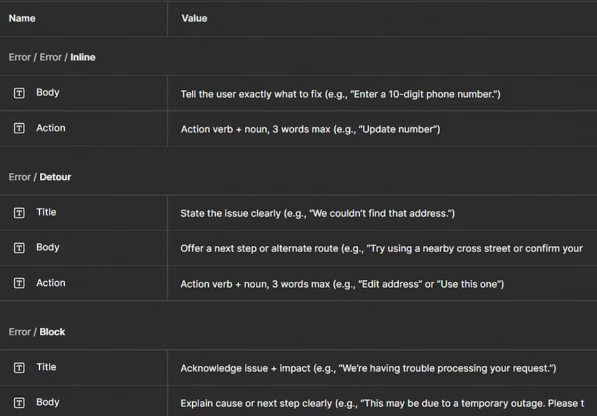
- Clarifies tone and structure across error types (Inline → Block) based on context and severity.
- Guides consistency with embedded writing prompts for title, body, and action.
- Keeps variants in sync so tone, structure, and visuals adjust automatically by severity.
- Centralizes guidance in Figma, removing the need for separate documentation.
- Scales easily by adding tagged, reusable templates for recurring use cases (e.g., address not found, payment failed).
My takeaway
This project reminded me that content design goes beyond writing microcopy. It's about finding the root of the problem, bringing people together, and building solutions that last.
Because when something goes wrong, whether it's a missing address or a payment error, users deserve more than just "Oops."