Helping small nonprofits send more readable newsletters
Problem
About 20% of support tickets mentioned the email builder. Customers' newsletters had small fonts, clutter, and poor contrast.
My role
Product Content Manager at WildApricot (Personify), working with a designer, the product lead, and developers.
The decision
Teach in the moment: an interactive walkthrough the first time someone opens the editor, instead of another help article.
Result
Most-viewed in-app engagement that month: 7,169 views.
Where the problem showed up
Beyond tickets, admins in our 1.6K-member Facebook group kept posting newsletters and asking how to make them "look more professional."
The decision: high impact, low effort
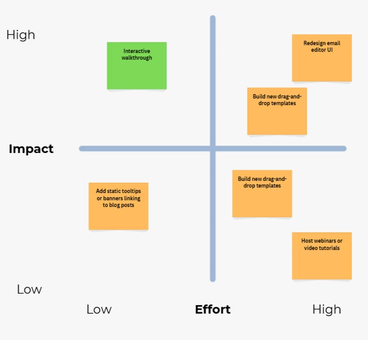
The designer and I compared options. An in-app tutorial won on both impact and effort. I prototyped it in a Gainsight PX sandbox so the product lead and developers could review the real copy in context before release.
Shipped
Results, August 2020
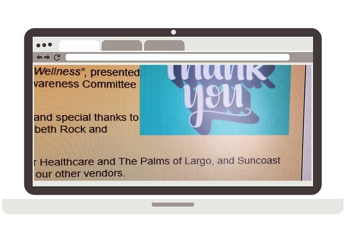
"A big thank you for the tips on the newsletter received when writing my newsletter. They were such a help and my newsletter looks heaps better, not to mention the spacing!"
Related: my article on mobile-friendly emails in WildApricot